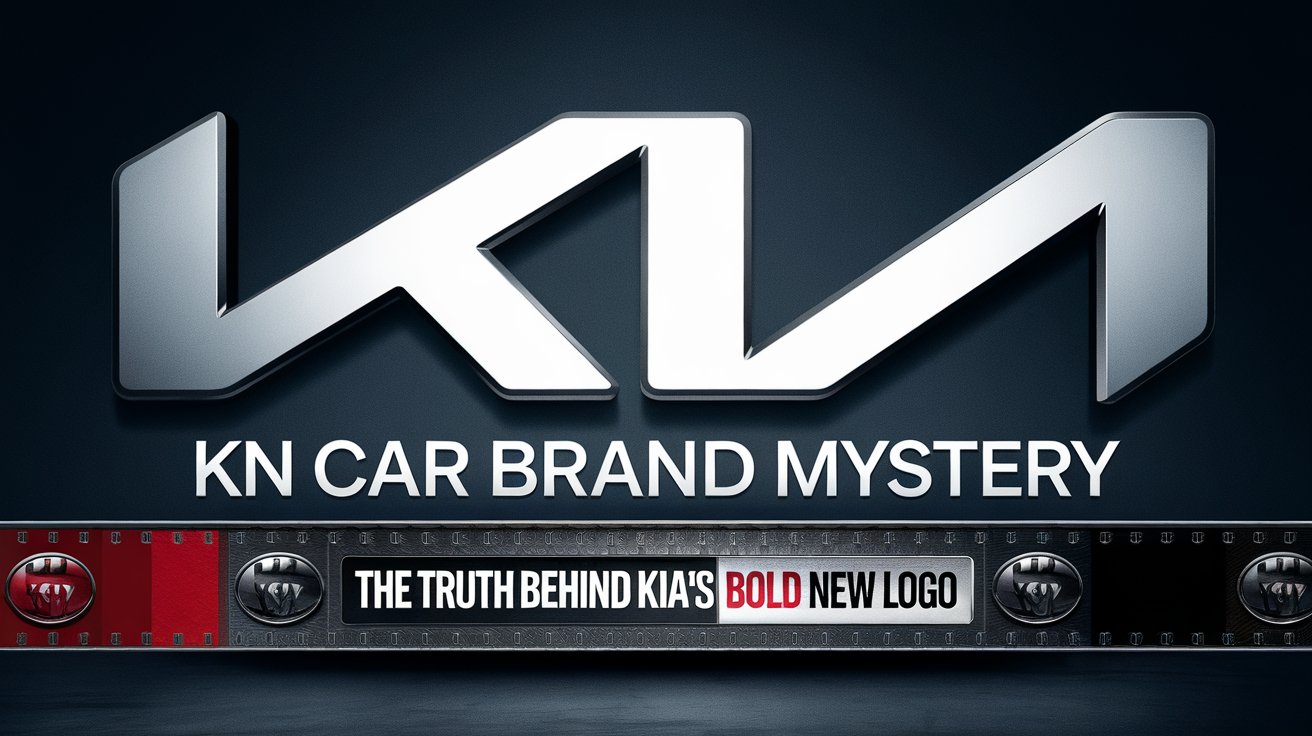
Recently, many people have found themselves puzzled by the appearance of a mysterious “KN” car brand.
This confusion has sparked conversations across social media and online forums, with many believing that a new car brand has entered the market.
However, the truth is much simpler—it’s all part of KIA’s rebranding efforts.
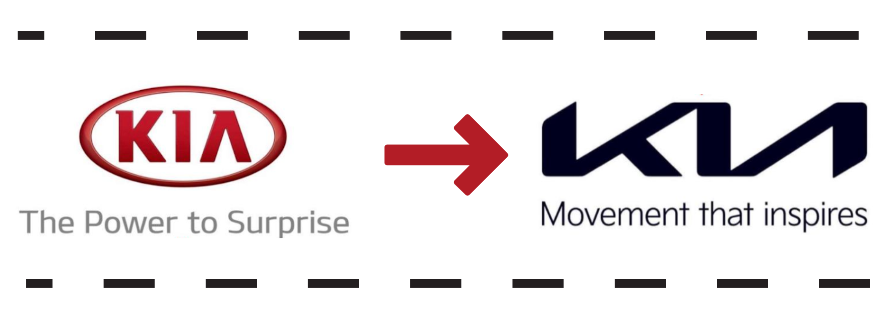
The latest stylized KIA logo has led to a widespread misunderstanding, with some interpreting the letters as “KN.”
Let’s dive into the reasons behind this confusion and the story behind KIA’s bold new look.
Why People Thought “KN” Was a New Car Brand
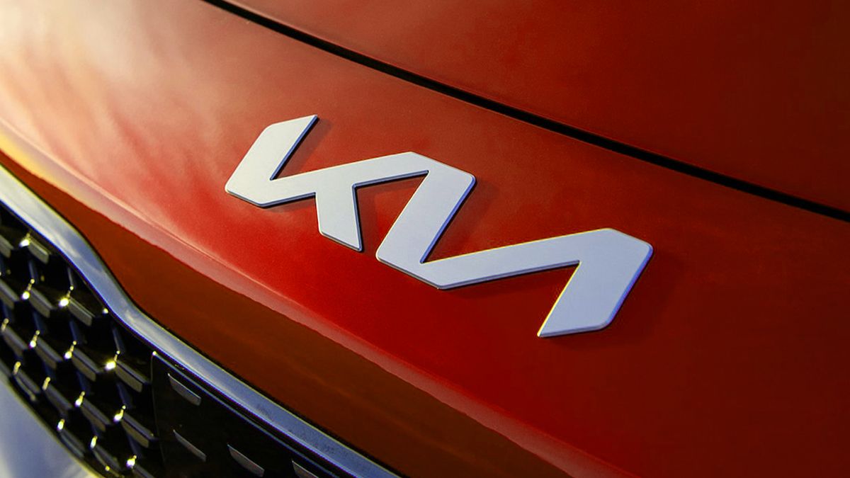
The confusion surrounding “KN” started when KIA unveiled its rebranded logo.
The sleek, modern design features angular lines that led many to mistake the letters for “KN.”
Since the design breaks away from the traditional rounder font of the old KIA logo, it creates a perception that the letters are entirely different.
This resulted in car enthusiasts and casual observers alike thinking that “KN” was a new car brand they had never heard of.
1. Social Media’s Role in Spreading the “KN” Myth
Social media played a significant role in amplifying the confusion.
As images of the “KN” logo appeared on new vehicles, users began sharing pictures and videos, asking if a new car manufacturer had entered the market.
Posts on platforms like Twitter, Instagram, and Reddit quickly spread, with many users tagging the “KN” car brand and speculating about its origins.
Memes and jokes about the mysterious “KN” car also went viral, adding to the momentum.
2. Where People Saw the “KN” Logo
Many first encountered the “KN” logo on new KIA models, particularly on cars’ rear or front grilles, where the stylized letters are most prominent.
Others saw the logo in KIA’s promotional materials, leading to further assumptions.
Billboards, TV commercials, and digital ads featuring the new logo only reinforced the idea that this was a fresh, unknown brand.
Car dealerships also displayed new KIA models with the logo, but since it was misunderstood, potential buyers thought these vehicles were from a brand called “KN.”
Why KIA Changed Its Logo
1. KIA’s Vision for a New Era of Mobility
KIA’s decision to change its logo is deeply rooted in its vision for the future of mobility.
The company is positioning itself as a leader in electric vehicles (EVs) and sustainable transportation.
The new logo is part of KIA’s broader initiative to transform its brand image from a traditional automaker to a forward-thinking company that embraces technological advancements and eco-friendly solutions.
The rebranding reflects KIA’s commitment to innovation, digitalization, and sustainability as it adapts to a rapidly evolving automotive landscape.
2. Modernizing for a Younger, Tech-Savvy Audience
In addition to embracing sustainable mobility, KIA’s rebranding aims to capture the attention of a younger, tech-savvy demographic.
The sleek, futuristic design of the new logo appeals to consumers who value cutting-edge technology and modern aesthetics.
With an increasing number of younger drivers looking for electric and hybrid options, KIA’s new logo and brand identity reflect the high-tech features and stylish designs of its new vehicle lineup.
3. Moving Beyond the Traditional Automotive Industry
KIA’s new logo also symbolizes its intention to move beyond the traditional boundaries of the automotive industry.
The brand has shifted its focus towards becoming a provider of innovative mobility solutions, offering vehicles and advanced services such as connected car technology, autonomous driving capabilities, and smart transportation systems.
By rebranding, KIA is signaling its evolution into a broader mobility brand, positioning itself at the forefront of future transportation.
How the KN Confusion Became Popular
1. Social Media Amplification of the “KN” Misinterpretation
The confusion about the “KN” logo gained significant momentum through social media.
As people began sharing images of the new KIA logo, many users misread it as “KN” and spread this misinterpretation across platforms.
The viral nature of social media allowed the confusion to increase quickly, turning what could have been a minor misunderstanding into a widespread phenomenon.
- Viral posts: People shared logo images, asking “What is KN?” on platforms like Twitter, Instagram, and Reddit.
- Memes: The confusion became the subject of memes, adding humor but reinforcing the misinterpretation.
- Influencers and car enthusiasts: Influencers and car enthusiasts contributed to the spread by discussing the “KN” car brand without realizing it was KIA.
2. Examples of Where People Saw the “KN” Logo
The “KN” misinterpretation became particularly prominent when people encountered the logo in various environments and advertising spaces.
- Car dealerships: Potential buyers visiting car dealerships saw the new logo on KIA models, leading them to believe they were looking at a new brand.
- Billboards and TV ads: KIA’s advertising campaigns, featuring the new logo on billboards and television, further perpetuated the idea that “KN” was a new, unknown brand.
- Online car listings: Websites listing cars for sale began featuring KIA vehicles with the new logo, and in some cases, listings incorrectly labeled the cars as part of the “KN” brand.
How Public Misinterpretation Snowballed into a Widespread Belief
What started as a simple misreading of the logo quickly escalated into a full-fledged belief that “KN” was a new car manufacturer.
This snowball effect occurred due to a combination of factors:
- Lack of immediate clarification: Many assumed the new logo represented a different brand since all audiences had not widely recognized KIA’s rebranding.
- Reinforcement through discussions: As more people talked about “KN” online, it became self-reinforcing, with users perpetuating the idea without fact-checking.
- Global reach of social media: The misunderstanding wasn’t limited to one region; people worldwide saw the logo, spreading the belief across different languages and cultures.
What the New KIA Logo Represents
1. The Design Elements of the New KIA Logo
The new KIA logo features a sleek, minimalist design that breaks away from the traditional font used in the previous logo.
The sharp, interconnected lines give it a futuristic feel, and while the letters “KIA” are present, the stylized approach has made it harder for some to recognize immediately.
- Interconnected letters: The letters “K”, “I”, and “A” are connected in a continuous line, symbolizing the unity and seamless experience KIA aims to provide.
- No breaks in the logo: The design deliberately omits the breaks between the letters, reflecting KIA’s vision of continuous evolution.
- Modern, angular look: The logo’s sharp angles and clean lines reflect KIA’s forward-thinking and innovation-driven philosophy.
3. Stylized Letters Stand For KIA’s Brand Evolution
KIA’s new logo is more than just a visual update—it represents the brand’s shift in focus towards innovation, sustainability, and modern technology.
- Innovation: The futuristic look symbolizes KIA’s dedication to cutting-edge automotive technology, particularly electric vehicles (EVs) and autonomous driving.
- Sustainability: The sleek, connected letters reflect KIA’s commitment to creating environmentally friendly mobility solutions, focusing on electric and hybrid vehicles.
- Customer experience: The logo’s seamless design mirrors KIA’s goal of providing a seamless customer experience, from vehicle design to service.
4. The Message Behind the Logo Redesign
KIA’s new logo is part of its larger rebranding effort, meant to redefine its role in the automotive industry.
This isn’t just a change in aesthetics—it’s a message to the world about the company’s transformation and ambitions for the future.
- Breaking free from tradition: By introducing a dramatically different logo, KIA signals that it is breaking away from its traditional image and embracing a bold new identity.
- Focus on mobility solutions: The logo is designed to resonate with KIA’s vision of being more than just a car manufacturer. It reflects their desire to become a future leader in mobility solutions, emphasizing smart, connected, and electric vehicles.
- Global aspirations: The modern design reflects KIA’s international ambitions, aiming to attract a new generation of consumers who value technology, sustainability, and sleek design.
What KIA Has to Say
1. KIA’s Official Response to the Logo Confusion
KIA has addressed the public confusion regarding its new logo and the mistaken identity of the “KN” brand. While it has embraced the buzz and attention, the company has taken the opportunity to clarify the situation and emphasize its rebranding efforts.
- Clarification through statements: KIA has released statements clarifying that the stylized logo is indeed the new version of their brand identity, not the creation of a new company.
- Positive engagement with the confusion: Rather than shying away from the misunderstanding, KIA has used the confusion as a conversation starter to highlight their vision for the future.
- Reinforcing their rebrand message: KIA reiterated that the new logo is a symbol of their evolution towards becoming a leader in innovative and sustainable mobility solutions.
2. How KIA Is Addressing the Public’s Misunderstanding
KIA is aware of the widespread misconception and has worked to address it across multiple platforms, turning a challenge into a marketing opportunity.
- Engaging with social media: KIA has taken to social media to directly engage with users who have expressed confusion, using the platform to clarify that “KN” is simply a misreading of their new logo.
- Marketing campaigns: KIA has ramped up its marketing efforts to reinforce the new logo’s association with the brand. Recent ad campaigns and commercials prominently feature the logo alongside the traditional “KIA” name to help viewers make the connection.
- Collaborating with dealerships: KIA has also worked closely with its dealership partners to ensure that consumers are well-informed about the new logo and the reasons behind the rebranding.
3. Public Reactions to KIA’s Response
The public’s reaction to KIA’s clarification has been largely positive, with many appreciating the brand’s openness and humor in handling the situation.
- Embracing the meme culture: Many have found KIA’s response to the “KN” confusion humorous, especially in how the brand leaned into the viral nature of the misunderstanding rather than resisting it.
- Increased brand awareness: Surprisingly, the confusion has worked in KIA’s favor, with increased visibility for the brand and its new logo. Thanks to the “KN” buzz, many people who weren’t familiar with KIA’s rebranding are now aware of the changes.
- Reinforcement of brand identity: KIA’s clarification efforts have helped solidify the association between the new logo and its forward-thinking approach, ensuring that consumers understand the deeper meaning behind the rebranding.
Conclusion
In conclusion, the confusion surrounding the “KN” car brand is simply a misinterpretation of KIA’s new, stylized logo.
While it may have caused some initial misunderstandings, the attention has ultimately worked in KIA’s favor, helping to highlight its bold rebranding efforts and future-focused vision.
As KIA continues to innovate and push boundaries in the automotive industry, the new logo symbolizes its commitment to sustainability, technology, and modern mobility.
“KN” may have been an accident, but KIA’s transformation is intentional and worth watching.

